Sunday, November 30, 2008

Week 6


A1 Research_Saul Bass-a great graphic designer in 20th century

Hi all, in this week, we really busy for Midterm exams and assignments. I did not find out more idea for blog entries so I upload my A1 for everybody so we can discuss about this.

I have done a research about great graphic designer Saul Bass. He is well-know by animated film title sequences and company logos. Saul Bass is a legend in 20th century...


I hate doing research but I really love what I have got after researching. In fact, my idol in DIM1 is Paul Rand and now is Saul Bass. They both have some similar points in thinking and working. Hope you like Paul Rand and Saul Bass and feel free to come with me to discuss about them.


Sunday, November 23, 2008

Week 5_Entry 2

Design the letter 'M' in Illustrator

Study about Typography, I tried to create a letter 'M' follow the shape of ivy and wings. I just simply used Brush to draw freely and adjust it smoother. Now, this is my letter 'M' I have created and put it in the word 'Memory':


I also have a nice picture which presents the sadness of a Hanoi woman. She is homesick. She is sitting with an oil lamp and a dish of 'banh day' (kind of rice-cake). All of them are belong to the North where is her hometown. The word 'Memory' I put in the gray sky so it looks like a bird...the bird is trying to find the way back to its home...


Hope you like my work

Image source: http://rarfaxp.riken.go.jp/~dang/paintings/memory2.JPG

Saturday, November 22, 2008

Week5_Entry 1

Wow, wonderful sunlight beam effect in Photoshop


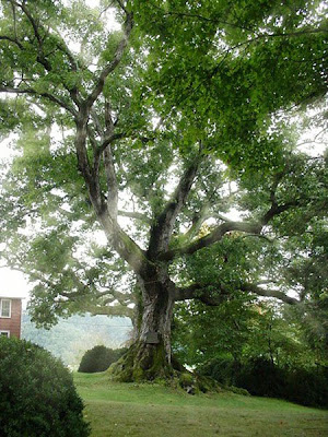
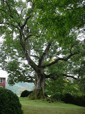
I found an excellent tutorial for this week. Now I am going to share it for you. First, look at my original image. This effect is very good to apply in a picture of a big tree (there are suitable images on Google by searching "oak" to practice if you like). The tutorial is quiet long and hard so I present it shortly and skip some simple steps.


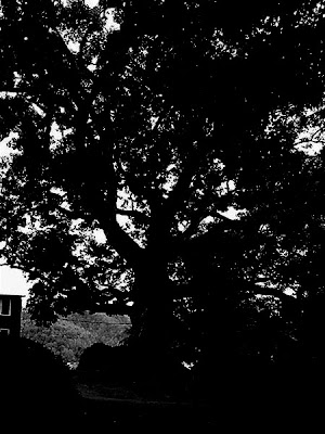
Now, go to Channel palette and duplicate the 'Blue layer'. Next, darken the 'Blue copy' channel layer like this:


Ok, now, hold down the Ctr (Win)/Command (Mac) and right click on the 'Blue copy' channel layer. Ok ok, ignore what you see and turn back to the Layer palette. You will see...nothing changed, haha...

Now, add a new layer and press 'D'. Press Ctr+Backspace (Win)/Command+Delete (Mac) to fill the selection with white. Again, you will see...nothing happened. Interesting!!!

Duplicate the new layer you have created. Go to Filter menu -> Blur -> Radial Blur -> click 'zoom', 'best' and adjust the Blur center and Blur amount as you like. Now you have the main part of the effect. To make it better, use Outer Glow and the blend mode is Soft Light. Now we have:


Is it great? I will make it more real by create the reflection effect on the ground. The "nothing" preparation above will be used now. Back to layer 1, press Ctrl/Command T and resize it. Make it smaller vertically and drag it down until the reflection appears on the ground. Finally, change the blend mode of it to Overlay. We got it!


Image source: http://www.ovta.org/2007%20March%20Page%20Pict/3%20Pemberton%20Oak/Pemberton%20Oak%202001%20MVC-129S.JPG

Sunday, November 16, 2008

Week 4_entry 2

Simple glow effect in Photoshop

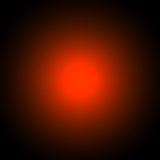
Now, let try to create a nice image with glow effect. This tutorial is really popular and I tried to make one.

Firstly, create a gradient field like this one. You can use any kind of gradient you like.


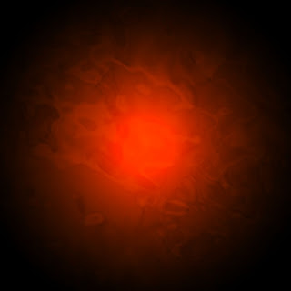
Now, go to Filter menu, choose Render -> Clouds. You have this one:


Next, create some line and dots by using Brush tool. Then, delete its outer line, adjust effects: Drop Shadow, Outer Glow, Color Overlay at layers window until you have the glow effect. Once again, you can create your own color style as you want.


Add text in a new layer and copy layer style of lines layer and paste to text layer. This thing make sure your text and lines have a same style.
And this is my final image. Is it kool ?


Thursday, November 13, 2008

Week 4_entry1

Funny Puzzle effect in Photoshop

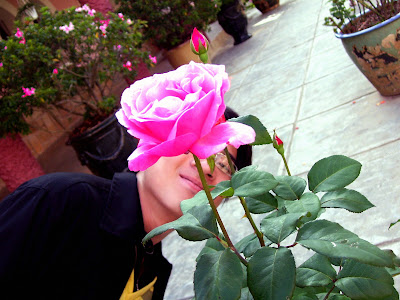
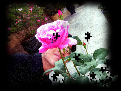
Hi guys, in this entry I will show you an interesting effect in PS. Before we start, I recommend you to choose simple pictures to edit. I mean not too much details pictures. They should be pictures of big objects. For example, I have my own picture taking from DaLat city:

It is quite simple. The objects (nice rose, ugly face) are big.

Then, adjust the image more colorful and contrast:


Next, add puzzle effect to the image. Go to Filter menu ->Texture -> Texturizer. The puzzle effect will not exist already so you have to load it. Go to the black arrow and chose Load Texture. Next, find the puzzle texture in Adobe Photoshop folder. Find Presets folder -> Textures -> chose Puzzle texture.
Now, adjust some numbers as you like and we have the result:


However, the picture was still boring. I made it more interesting by taking out some puzzle pieces. Remember, keep some puzzle pieces and drop shadow for them to get a 3D felling.


This is my final work. Hope this entry is useful.

Sunday, November 9, 2008

Week2_Entry 2

GESTALT EXERCISE (cont')


I post one more work for Gestalt practice. I think that this work is not as good as the first one. However, I feel totally happy with it. Here is my image:


Now, we can see the closure concept is quiet simple. The lines of flowers border the image as a frame. The significant point here is the body text was arranged as a triangle and concentrate to the top. This thing impresses the title.

Once again, I need practice more...

Week2_Entry 1

GESTALT EXERCISE


Wow, this exercise is so exciting. I understand more about basic design elements and principles. Enjoy my work and see how wonderful the gestalt is...

You can easily recognize the closure concept throughout the circle of flowers. Continuance element is not quiet clear in this picture. The thin plant at the center just makes us focus more on the text slightly. Beside that, the body text and the title were re-arranged to look like a seed which is related to the topic.

Gestalt is a simple theory but it is really hard to apply it in design. I need more practice in this field.

Week 1_Entry 2

Blending images in Photoshop

In this week, our teacher introduced us about blending method in Photoshop. This is a very useful effect in image editing. With it, we can easily make effective image especial for poster. I have taken 2 images (one of them is the poster of the film 'PS: I love you') from the internet and edited them as a poster with Hollywood style. Here are 2 original images:


I combined them to be one. I used layer mask and gradient tool to make it. I resized it as well.


Next, I think adding noise (2%) for it will make 2 original images more related and I ignored its colors.


Next, I used 'Color fill and adjustment layer' tool (next the 'Create new layer' tool) to add color for the picture. I used a slight orange which is warm and very suitable for Hollywood style.


I like this work. Hope to receive your comment.

Image sources:

http://www.hypnotherapylifesolutions.co.uk/sunset_couple.jpg.jpg

http://www.geckoandfly.com/wp-content/uploads/2008/06/ps_i_love_you_film_movie_torrent_download.jpg